

Medicine Reminder
Project as a part for Google UX Design Certificate
PROCESS HIGHLIGHTS
Design responsibilities overview
The goal
The primary goal of the medicine reminder app project was to provide users with a user-friendly and intuitive mobile platform that effectively reminds and assists them in managing their medication schedules.
Responsibilities
I led various stages of the design process, including user interviews, paper and digital wireframing, low and high-fidelity prototyping, conducting usability studies, ensuring accessibility, and continuously iterating on designs to ensure responsiveness and user satisfaction.
My role
- UX Research
- Sketching
- Prototyping
- Wireframing
- User Testing
Disciplines
- User Experience Design
- User Interface Design
Timeline
Apr - May 2022
PROCESS HIGHLIGHTS
The Process
Research
- User Research
Synthesis
- User Persona
- User Journey map
Ideation
- Low-Fidelity Prototype
- Usability study
Final Designs
- Mockups
- High-Fidelity Prototype
- Final Prototype
Reflection
- What I Learned
RESEARCH
User Research
I talked to users to learn what they needed from the app. Using empathy maps, I understood their struggles and goals. Initially, I focused on people needing help with medication reminders. But I found out they also faced other challenges like side effects and complex dosage schedules, so I made sure the app addressed all these needs.
SYNTHESIS
User Persona
I developed a user persona to identify the ideal user who would benefit most from a medicine reminder app. This process allowed me to focus on the goals, needs, and frustrations of a core user, specifically someone managing chronic conditions or multiple prescriptions and seeking a simple, reliable solution to help them stay on top of their medication regimen.
Sarah Thompson | 62
HR Manager
from NYU
 Goals
Goals
- Take medications on time and as prescribed without missing doses.
- Effectively manage multiple medications with different schedules.
- Reduce stress and worry about missing doses.
- Keep track of medication history for health record accuracy.
 Needs
Needs
- A simple, user-friendly interface to set reminders for each medication.
- Customizable notifications for different times and dosages.
- Notifications for missed doses or upcoming medication schedules.
- A feature to track medication history and refill schedules.
 Pain Points
- Forgetting to take medication on time due to a busy lifestyle.
- Difficulty in managing multiple medications with different dosages and schedules.
- Confusion around changing prescriptions and dosage instructions.
SYNTHESIS
User Journey map
Next is the user journey, which focuses on Sarah’s current experience using a medication app. It highlights the challenges she faces, such as forgetting to set up her medications properly, dealing with notifications that don’t align with her schedule, and confusion around managing multiple prescriptions. These difficulties affect her ability to consistently take her medication on time and stick to her health regimen.
Emma Johnson
Scenario: Sarah wants to ensure she never forgets to take her medications on time and manages multiple prescriptions efficiently.
Starting
Downloads a medicine app to help her remember to take her medications and avoid missed doses.
Exploring
Starts exploring the app, but finds the interface to be overwhelming with too many options and confusing menus.
Conflicting
Faces difficulties with managing overlapping medication schedules due to unclear options and a cluttered interface.
Quitting
Frustrated by the complex interface and inability to properly manage her medication reminders, decides to quit using the app.

“I need a way to stay notify of my medications. This could help me avoid missing doses.”
Installs the app. Begins setting up her medication profile by adding medications, dosages, and times.
“This looks more complicated than I expected. There are so many features—where do I even start?”
Attempts to add her medications but gets lost in the app’s complex menus.
“I can’t figure out how to adjust the reminders. It’s hard to tell if I’m doing this right with all these confusing settings.”
Struggles to set reminders due to unclear settings.
“This app is too confusing. I don’t have time to figure it out. I need something simpler and more straightforward.”
Uninstalls the app and chooses a simpler solution.
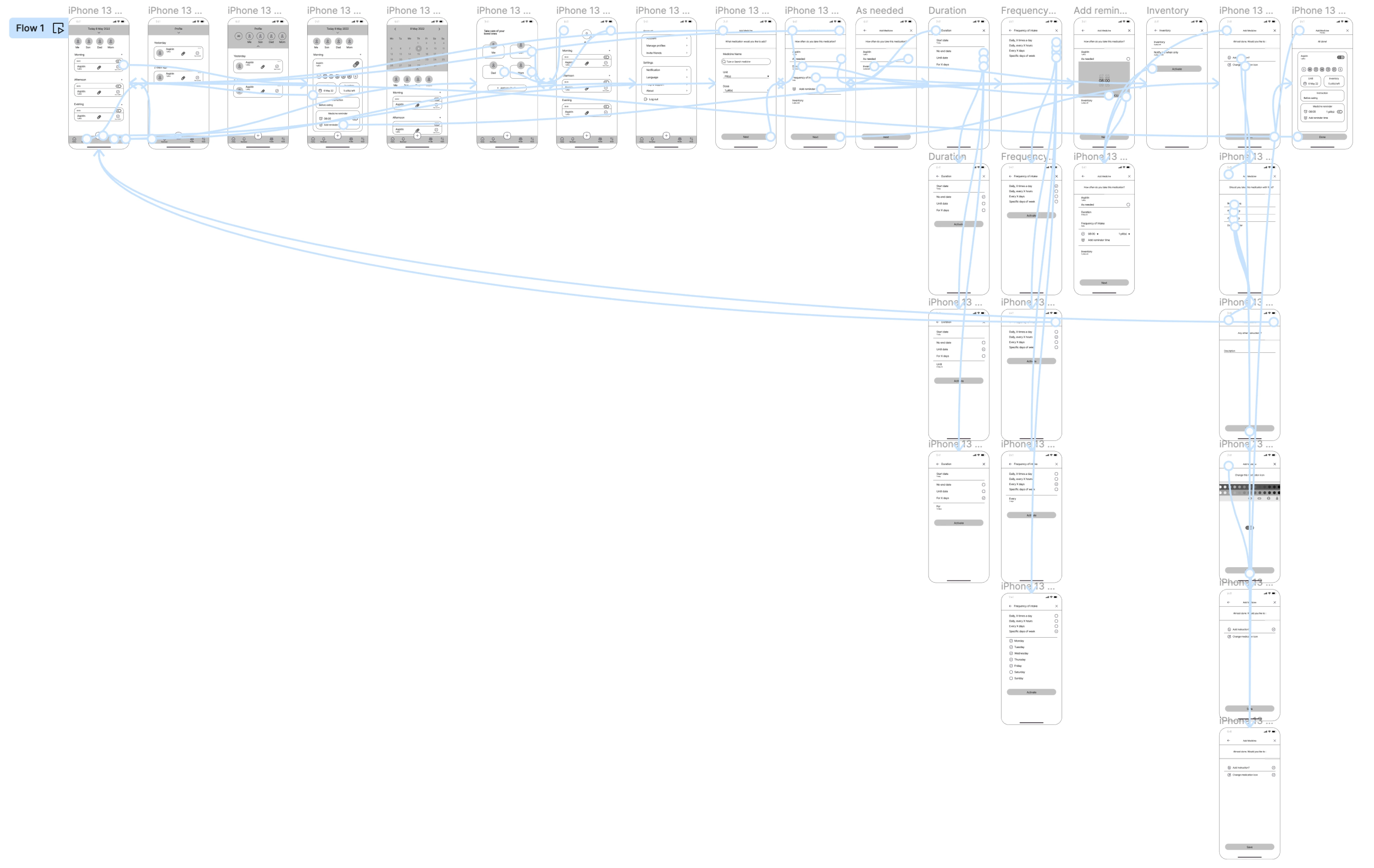
IDEATION
Low-fidelity prototype
View prototypeAt this point, I had received feedback on my designs by peers from Google UX Design Professional Certification. I made sure to listen to theirs feedback, and I implemented several suggestions in places that addressed user pain points.
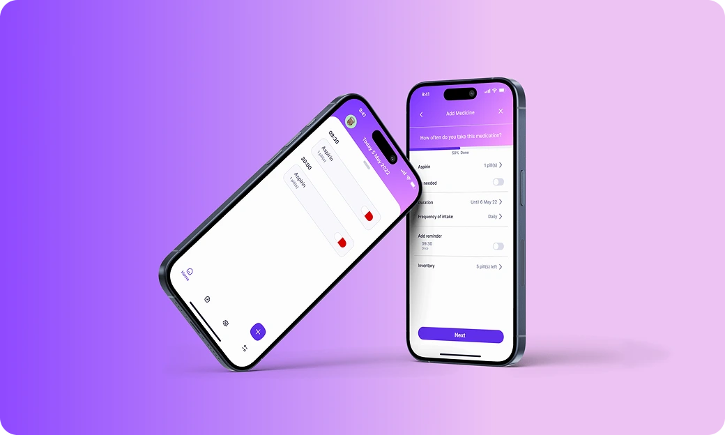
FINAL DESIGNS
Mockups
FINAL DESIGNS
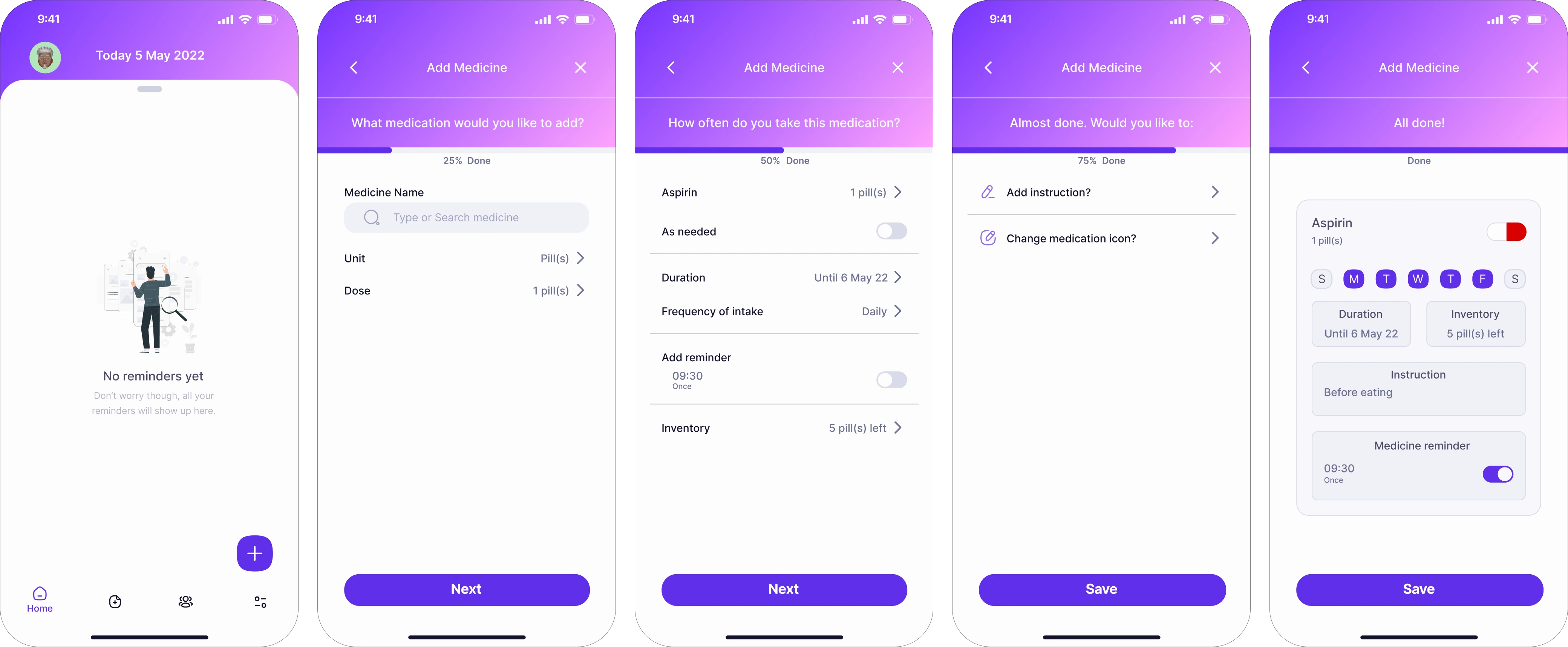
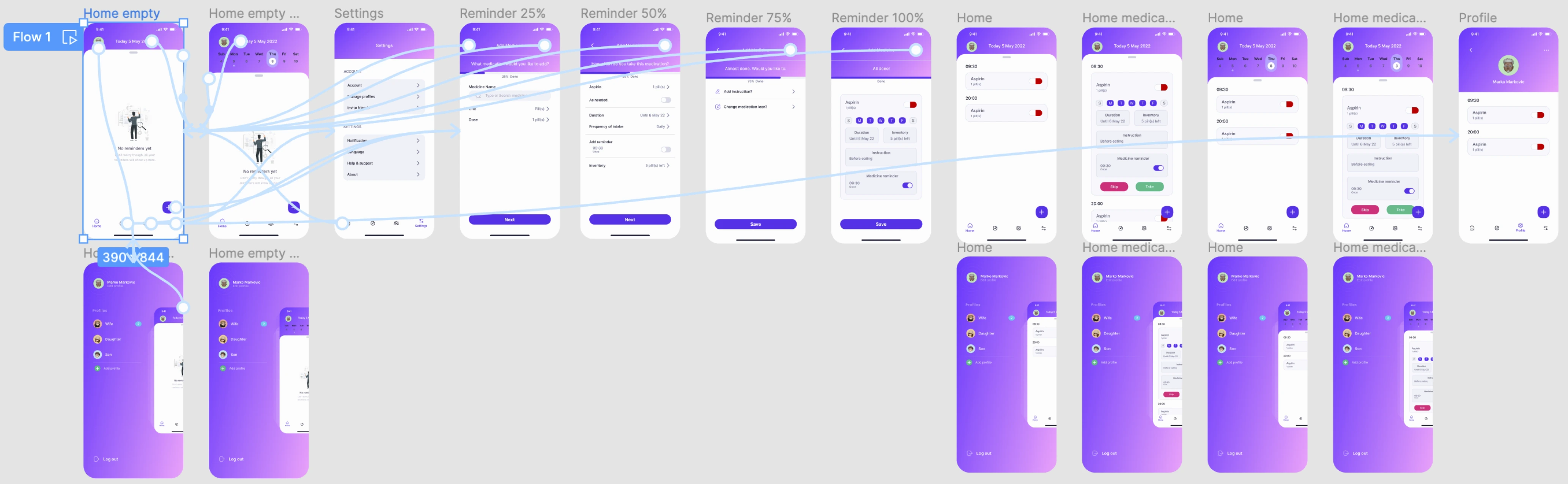
Hi-fidelity prototype
View prototypeMy hi-fi prototype followed the same user flow as the lo-fi prototype, and included the design changes made after the usability study, as well as several changes suggested by peers from Google UX Design Professional Certification.
REFLECTION
What I learned
Creating this project taught me the importance of empathizing with users, conducting thorough research, and iteratively refining designs to meet diverse needs, ultimately enhancing my skills in user-centric design and problem-solving.