

Apartment Scope
Project as a part for Google UX Design Certificate
PROCESS HIGHLIGHTS
Design responsibilities overview
The goal
The goal of Apartment Scope was to simplify apartment hunting by creating a user-friendly platform with clear listings, transparent pricing, and easy landlord communication. The focus was on streamlining the search process to help users find and secure rentals efficiently.
Responsibilities
Conducted user interviews, created paper and digital wireframes, developed low- and high-fidelity prototypes, and led usability studies. Focused on accessibility, design iterations, and responsive design to enhance the user experience.
My role
- UX Research
- Sketching
- Paper Prototyping
- Prototyping
- Wireframing
- User Testing
Disciplines
- User Experience Design
- User Interface Design
Timeline
Feb - Mar 2022
PROCESS HIGHLIGHTS
The Process
Research
- User Research
- Pain Points
Synthesis
- User Persona
- User Journey map
- Sitemap
Ideation
- Digital Wireframes
- Low-Fidelity Prototype
- Usability study
Final Designs
- Mockups Desktop
- Mockups Mobile
- High-Fidelity Prototype
- Final Prototype
Reflection
- What I Learned
RESEARCH
User Research
I conducted user interviews, which I then turned into empathy maps to better understand the target user and their needs. Several research methods were used to complete the Apartment Scope responsive website, from creating empathy maps and personas to conducting interviews and usability studies. Understanding our users' needs and how I can improve their experience is vital.
RESEARCH
Pain points
Navigation
Apartment search website designs are often busy, which results in confusing navigation.
Website layout
Websites don't provide clean and easy design experience.
Save apartment option
Users need to be able to save apartments they are interested in.
SYNTHESIS
User Persona
I developed a user persona to identify the ideal user who would benefit most from apartment hunting platform. This process allowed me to focus on the goals, needs, and frustrations of a renter, specifically someone navigating a fast-moving rental market, seeking transparent listings, and aiming to simplify their apartment search experience.
Sarah Mitchell | 28
Marketing Coordinator
 Goals
Goals
- Find a rental apartment quickly without dealing with unreliable listings.
- Compare prices, amenities, and locations easily.
- Secure a place without excessive back-and-forth with landlords.
- Avoid hidden fees and misleading rental terms.
 Needs
Needs
- A seamless platform with accurate listings and transparent pricing.
- Filters to narrow down search based on budget, location, and amenities.
- Clear communication with landlords or property managers.
- Mobile-friendly experience for searching on the go.
 Pain Points
- Inconsistent or outdated listings leading to wasted time.
- Hidden fees or unclear rental terms.
- Difficulty scheduling apartment viewings.
- Overwhelming search process with too many irrelevant results.
SYNTHESIS
User Journey map
Next is the user journey, which focuses on Sarah's current experience using rental platforms. It highlights the challenges she faces, such as cluttered interfaces, lack of save features, and unclear pricing, which impact her ability to easily secure an apartment.
Sarah Mitchell
Scenario: Searching for and securing a rental apartment using multiple websites and platforms.
Starting
Decides to move and begins browsing multiple rental websites.
Exploring
Uses filters to narrow down options based on location, price, and amenities.
Conflicting
Experiences difficulties in organizing search results and unclear pricing
Quitting
Makes a final decision or abandons the search due to frustration.

“I hope I can find a place that fits my budget and needs without too much hassle.”
Visits different platforms, sets up accounts, and starts looking at listings.
“These websites are cluttered—it’s hard to find what I need.”
Tries to use filters but struggles with confusing navigation, saves apartment links manually due to lack of a proper save feature.
“It’s frustrating when I can’t save apartments properly”
Spends extra time revisiting listings due to the lack of a save option, deals with unclear pricing, and considers giving up.
“I need a break from this, it’s too overwhelming.”
Decides to postpone the search for a better time.
SYNTHESIS
Site map
Difficulty with website navigation was a primary pain point for users, so I used that knowledge to create a sitemap. My goal here was to make strategic information architecture decisions that would improve overall website navigation.
IDEATION
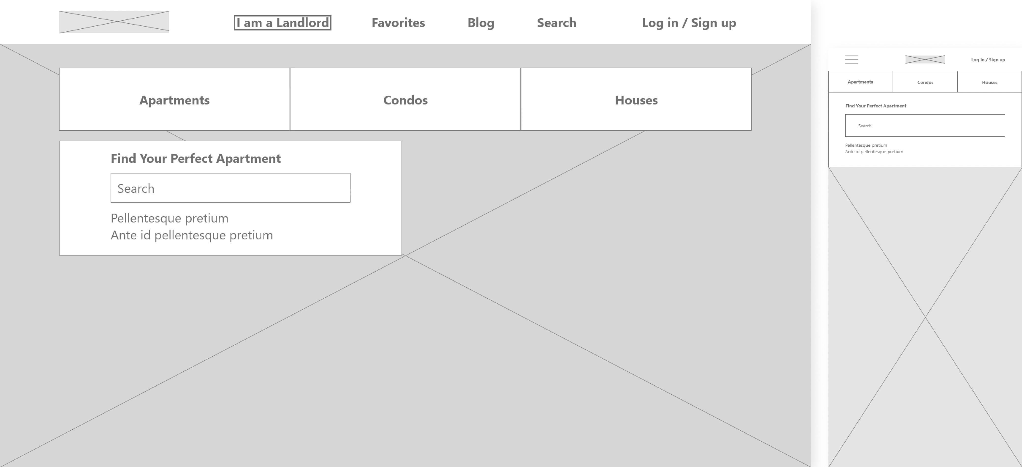
Digital wireframes
View prototypeMoving from paper to digital wireframes made it easy to understand how the Redesign could help address user pain points and improve the user experience. Because users access the site on a variety of different devices, I started to work on designs for mobile screen sizes too make sure the site would be fully responsive.
IDEATION
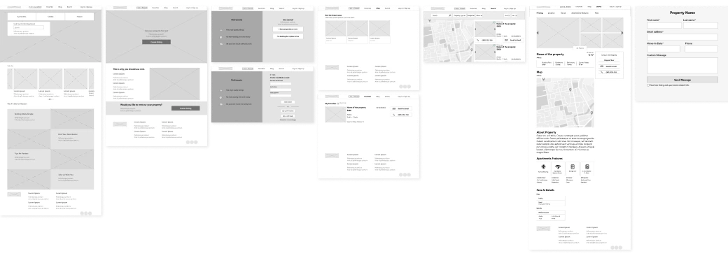
Low-fidelity prototype
View prototypeAt this point, I had received feedback on my designs by peers from Google UX Design Professional Certification about things like page organization. I made sure to listen to theirs feedback, and I implemented several suggestions in places that addressed user pain points.
IDEATION
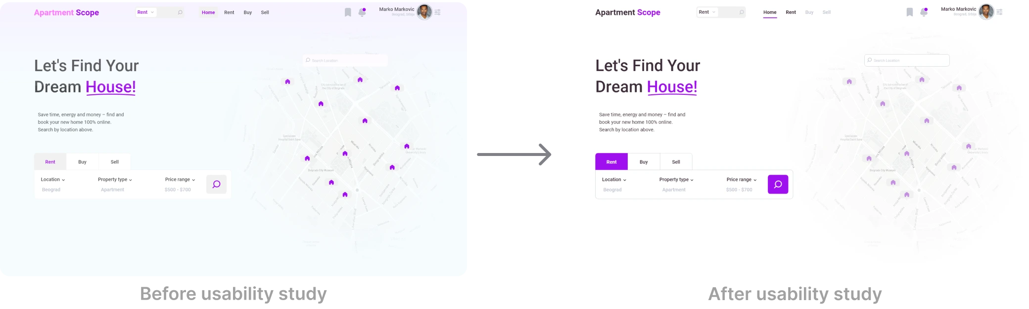
Usability study
View prototypeBased on the insights from the usability study, I made changes to the site color palette for more contrast to the layout.
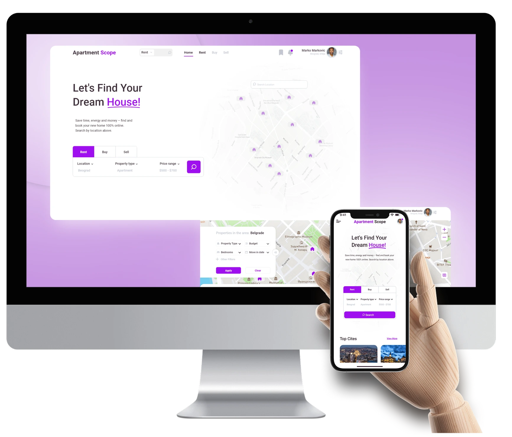
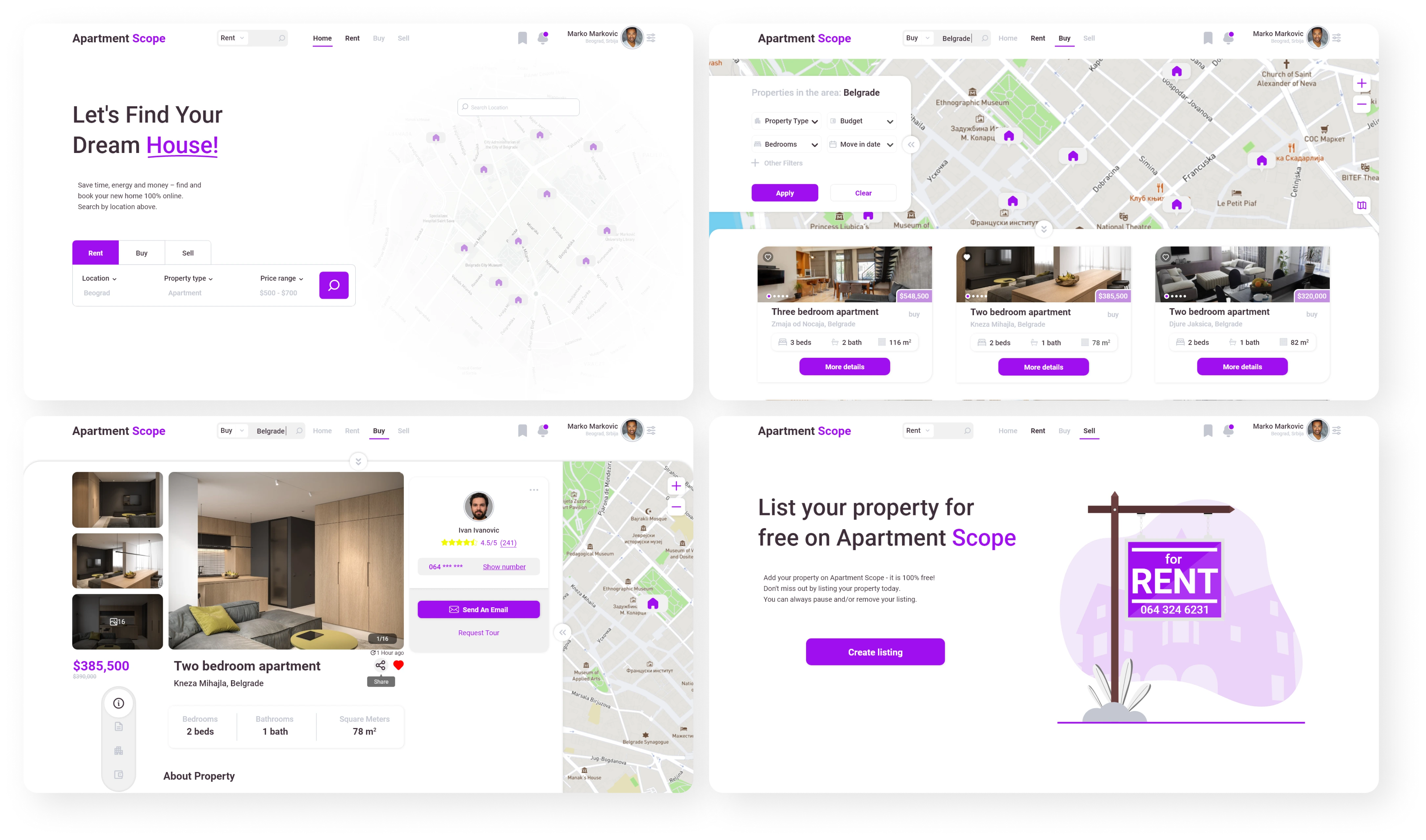
FINAL DESIGNS
Mockups Desktop
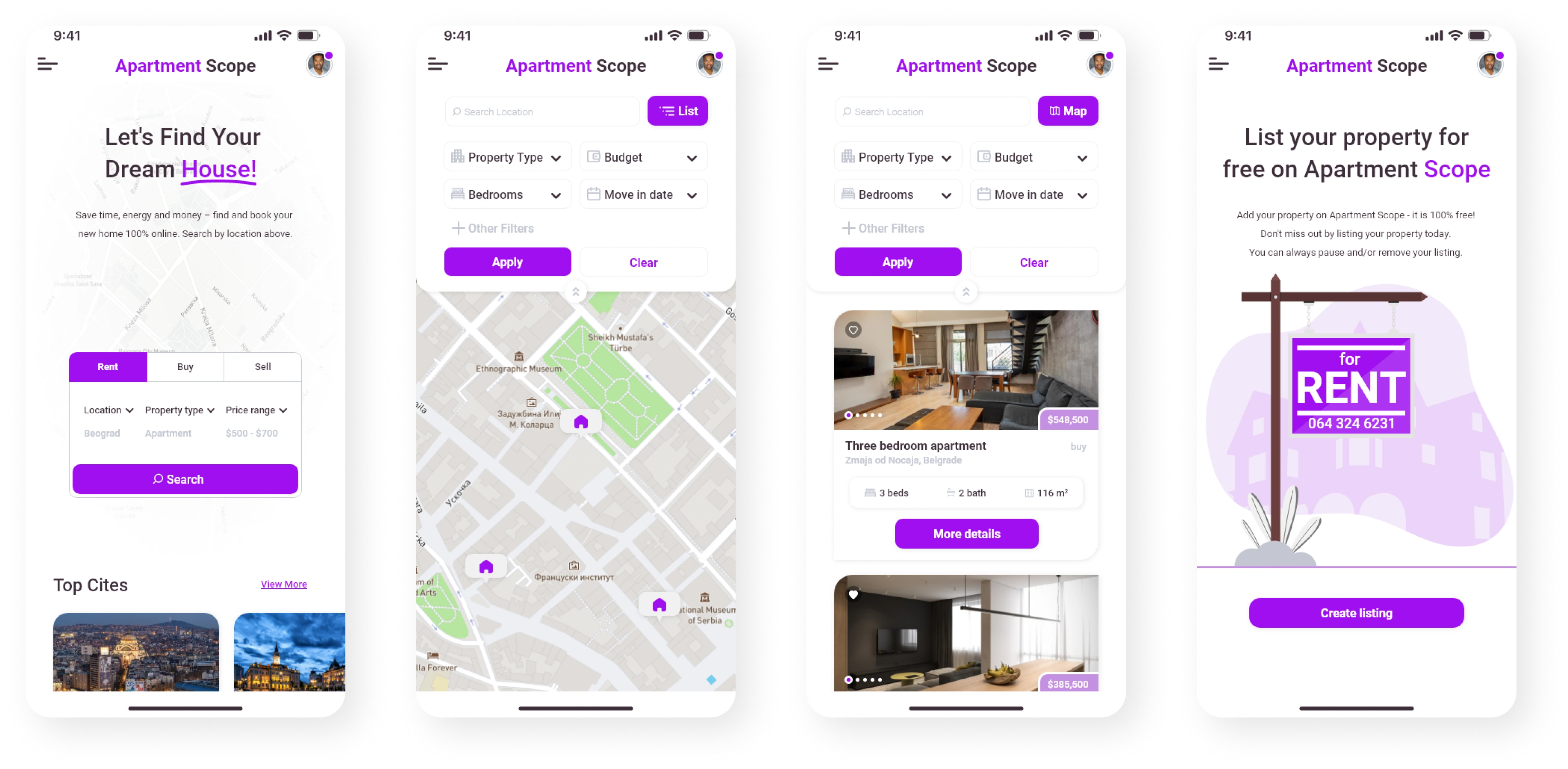
FINAL DESIGNS
Mockups Mobile
REFLECTION
What I learned
I learned that even a small design change can have a huge impact on the user experience. The most important takeaway for me is to always focus on the real needs of the user when coming up with design ideas and solutions.